Data Visualization Tools: Making Complex Data Analysis Simple and Accessible
"Visualization gives you answers to questions you didn't know you had." - Ben Shneiderman


Table of contents


No headings in the article.
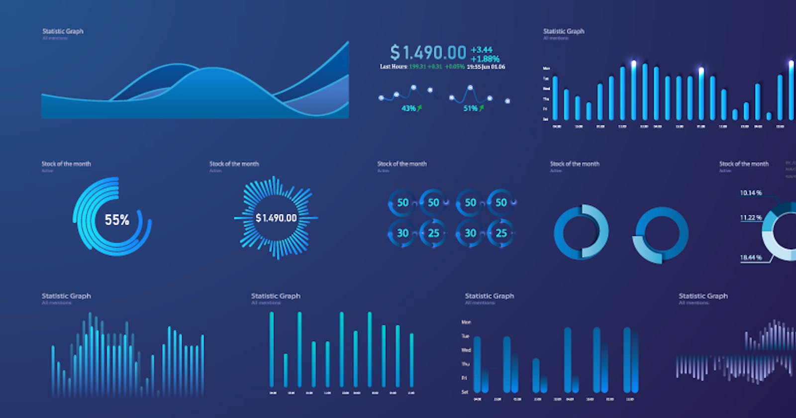
The visualization of data allows us to easily analyze and understand complex information in a graphical or pictorial format. Data visualization tools help transform raw data into meaningful insights by creating visually appealing and interactive visualizations. There is a wide range of data visualization tools available today, each with its unique features and capabilities.

In this article, we will explore some of the most popular data visualization tools widely used by businesses, analysts, and data scientists.
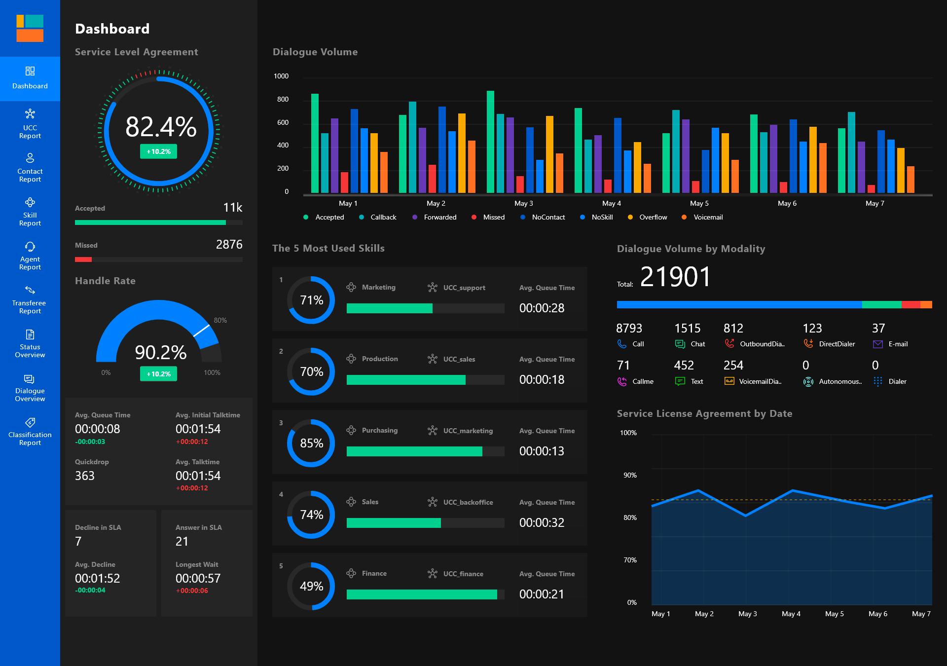
Tableau: Tableau is a popular data visualization tool widely used by businesses and analysts to create interactive and visually appealing dashboards. Tableau allows users to connect to multiple data sources and create various types of visualizations including charts, graphs, maps, and more. Tableau also offers a wide range of features such as drag-and-drop functionality, real-time data analysis, and the ability to collaborate and share insights with others.
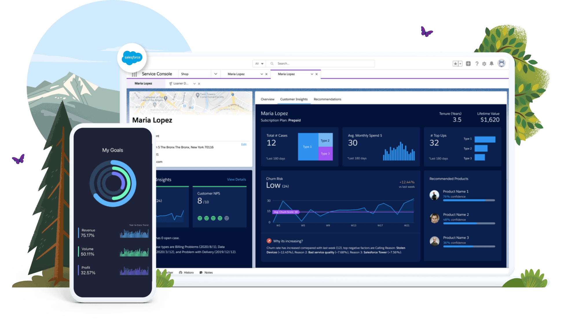
Power BI: Power BI is a business analytics service by Microsoft that allows users to create interactive visualizations and reports with a simple drag-and-drop interface. With Power BI, you can visualize data using charts, graphs, maps, and tables. It can connect to a variety of data sources, including Excel spreadsheets, cloud-based services, and databases.
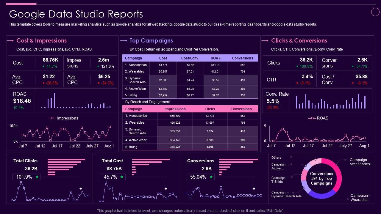
Google Data Studio: Google Data Studio or Google Lookers Studio is a free data visualization tool that allows users to create interactive dashboards and reports with real-time data. Google Data Studio integrates with other Google products, such as Google Analytics and Google Adwords. It allows users to connect to a variety of data sources, including spreadsheets, databases, and cloud-based services.
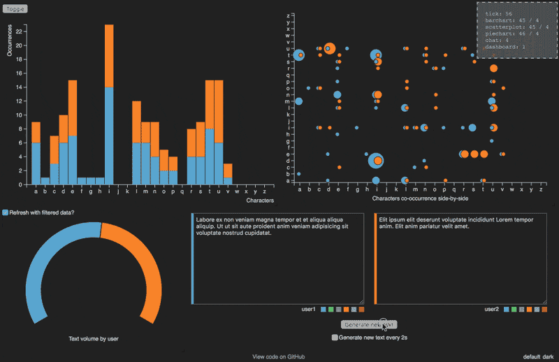
D3.js: D3.js is a JavaScript library widely used for creating custom and interactive data visualizations. D3.js allows users to create a wide range of visualizations, including charts, graphs, maps, and more. It provides a high degree of flexibility and customization options.
Plotly: Plotly is a cloud-based data visualization tool that allows users to create interactive charts, graphs, and maps with real-time data. A wide range of customization options are available through plotly, and it integrates with a variety of programming languages, including Python, R, and MATLAB.
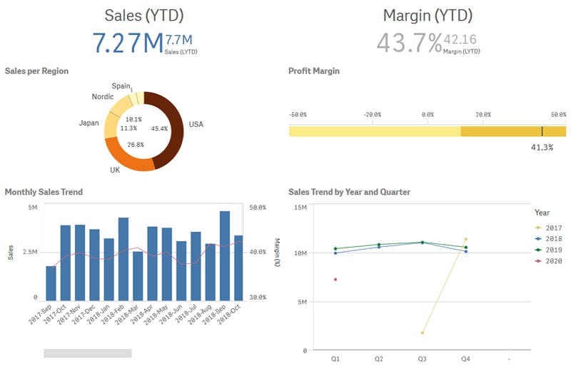
QlikView: QlikView is a data visualization tool widely used by businesses to create interactive dashboards and reports with real-time data. QlikView offers a wide range of data visualization options, including charts, graphs, and tables. It allows users to create custom reports and visualizations with drag-and-drop functionality.
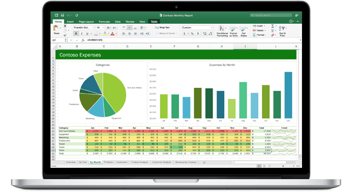
Excel/Sheets: Excel/Sheets is a widely used spreadsheet software that also offers basic data visualization capabilities. It allows users to create charts and graphs with a simple interface and provides a wide range of customization options, including chart types, colors, and layouts.
In conclusion, data visualization tools play a crucial role in transforming raw data into meaningful insights that help businesses and analysts make informed decisions. With the wide range of data visualization tools available today, businesses and data scientists can choose the tool that best fits their needs. They can also create visually appealing and interactive visualizations that can help them gain a competitive edge.